
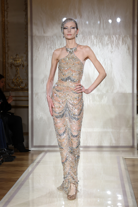
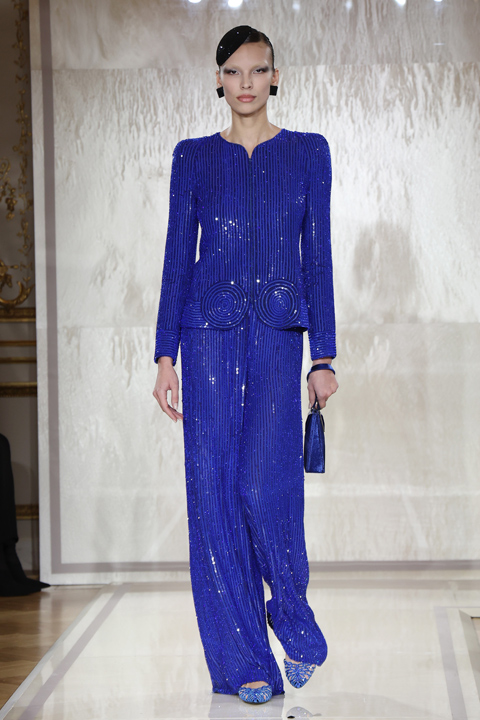
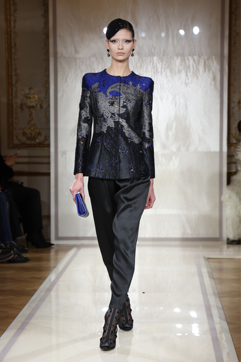
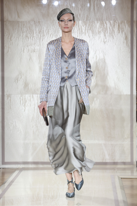
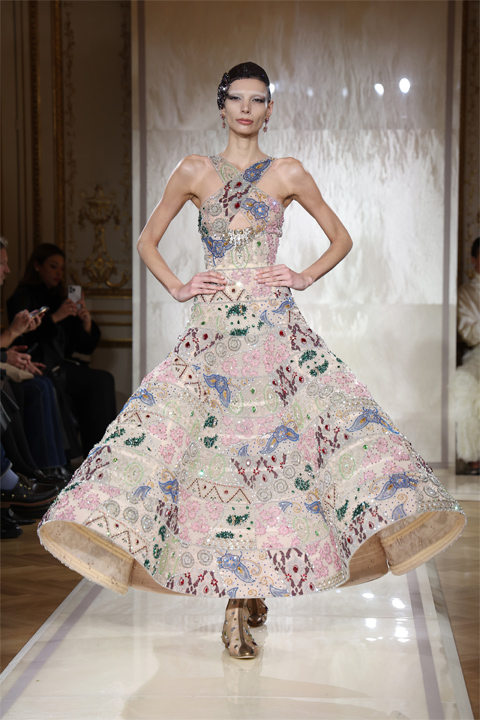
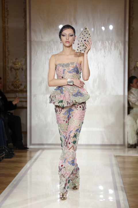
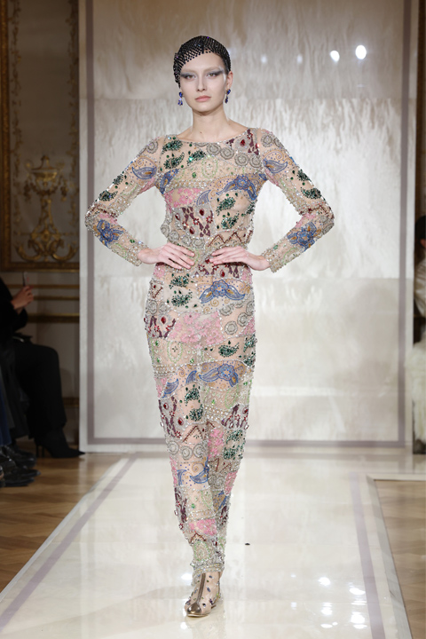
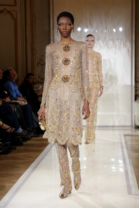
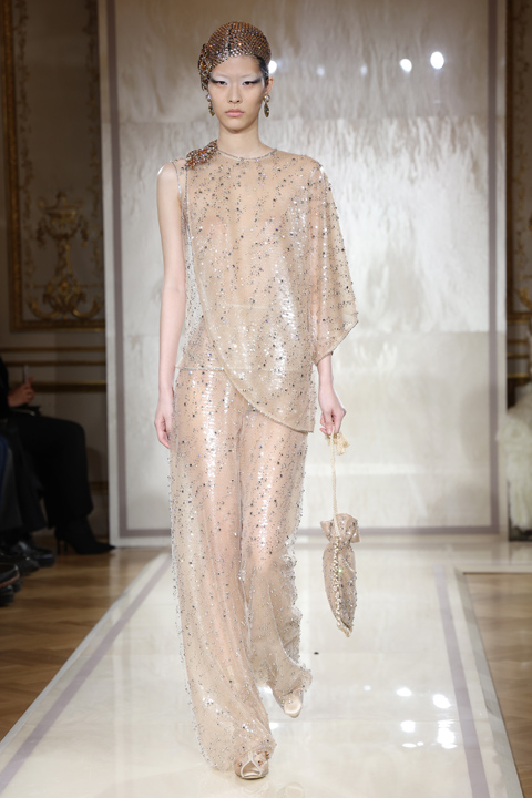
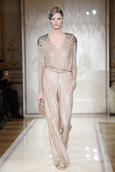
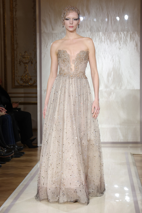
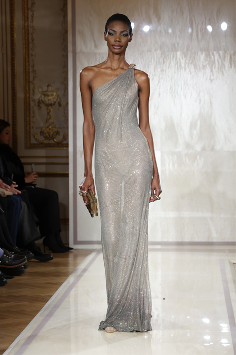
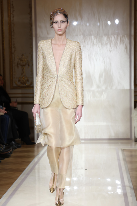
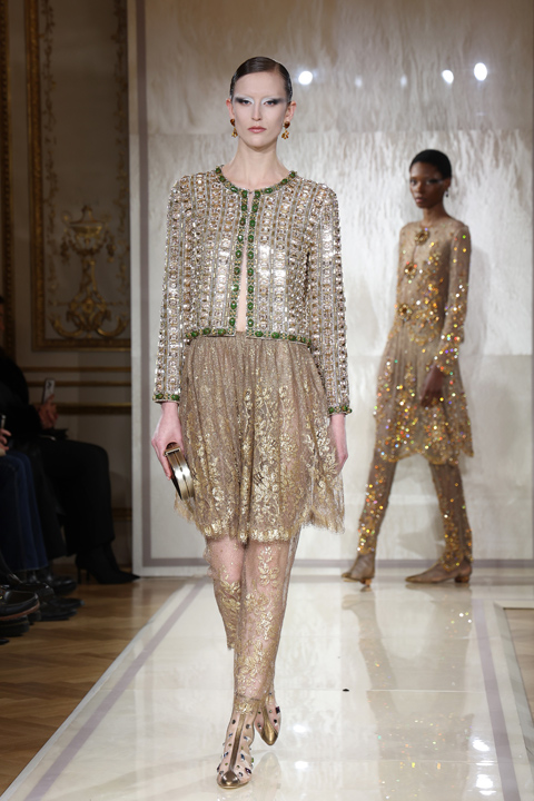
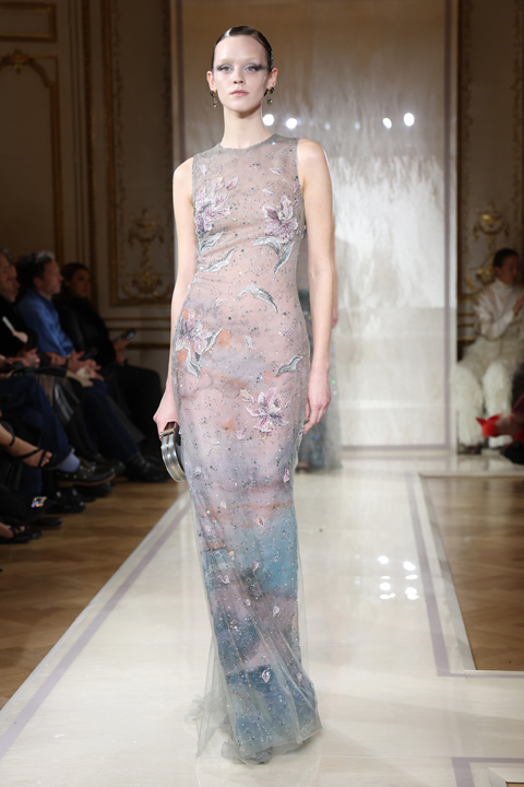
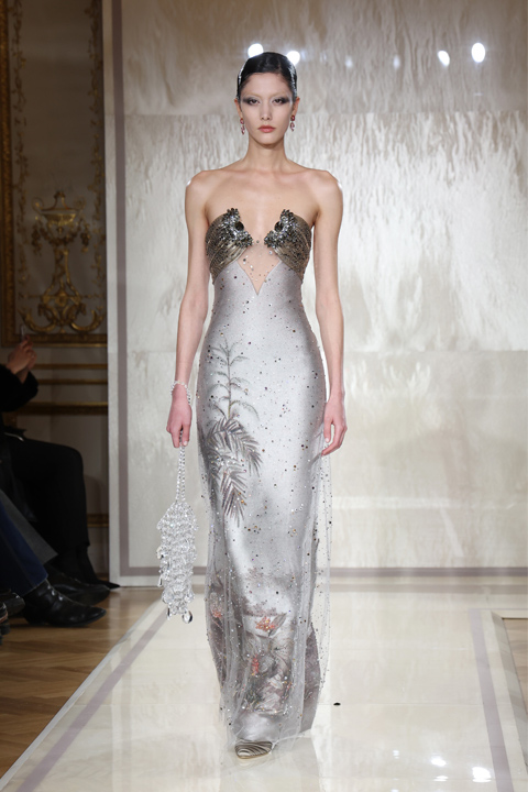
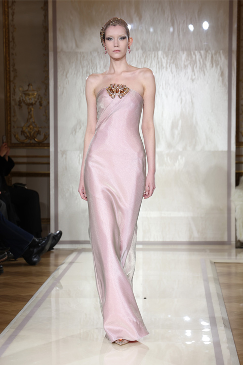
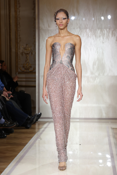
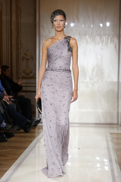
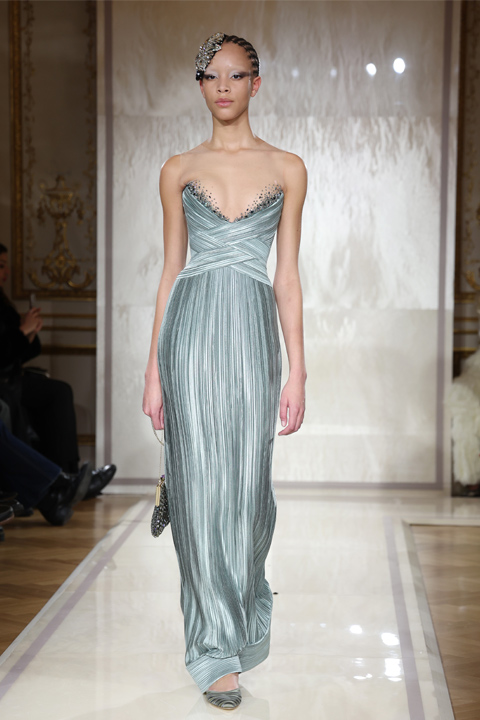
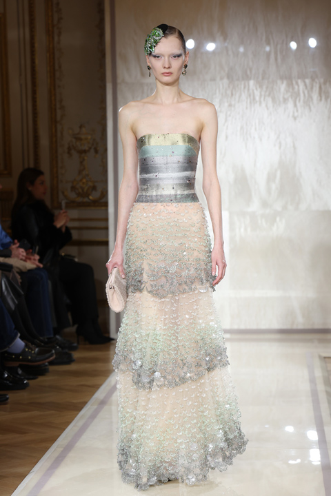
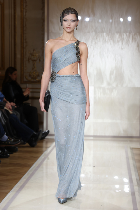
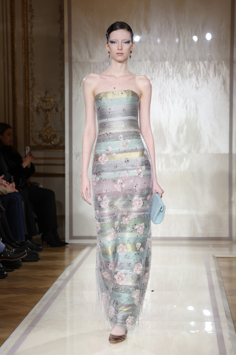
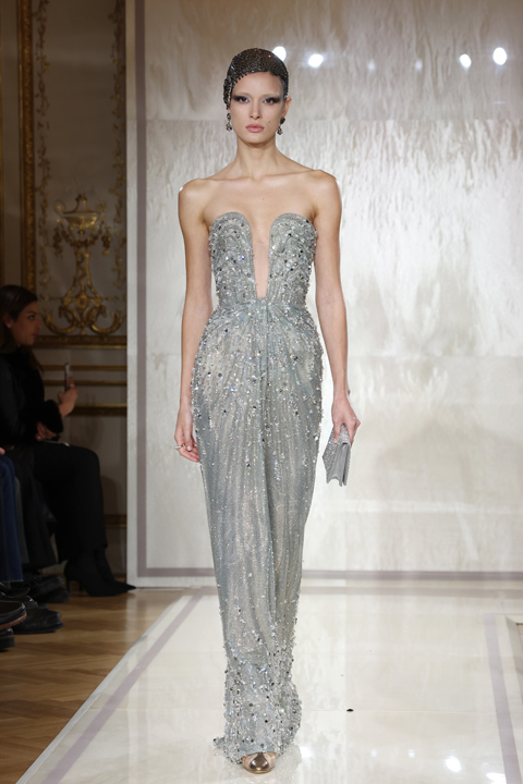
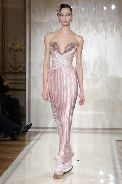
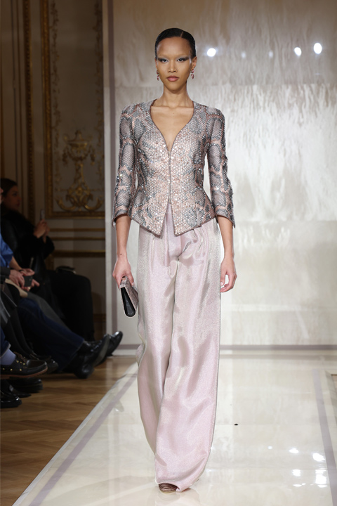
Armani Prive İlkbahar-Yaz 2025 Haute Couture Defilesi

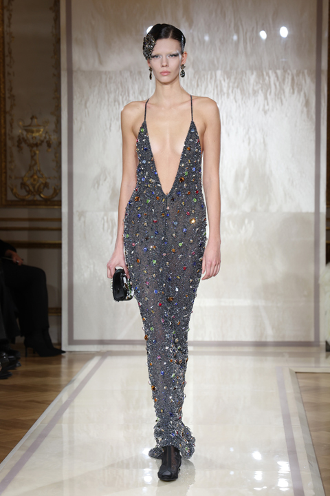
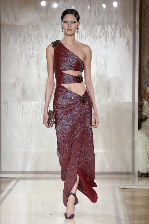
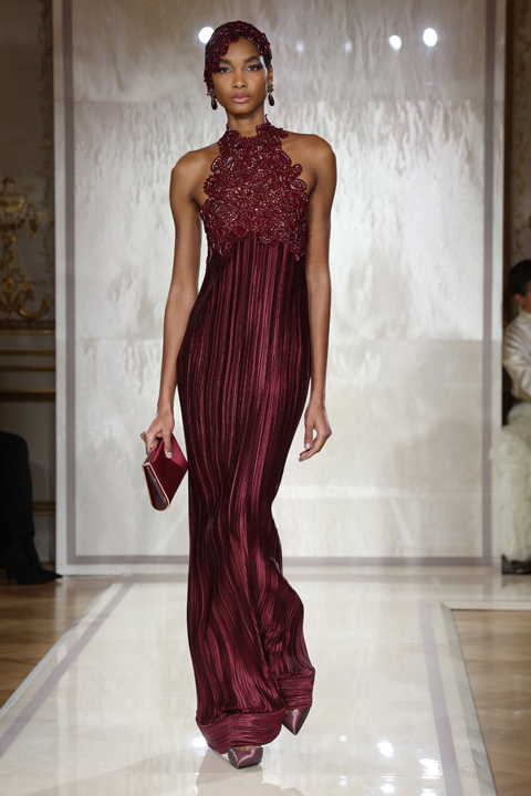
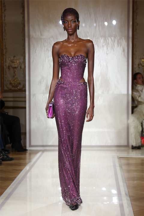
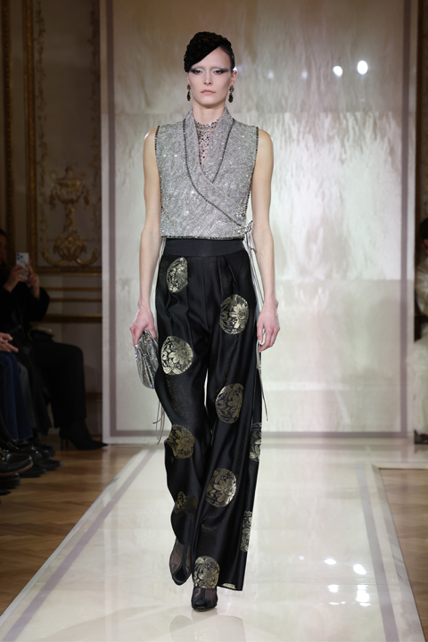
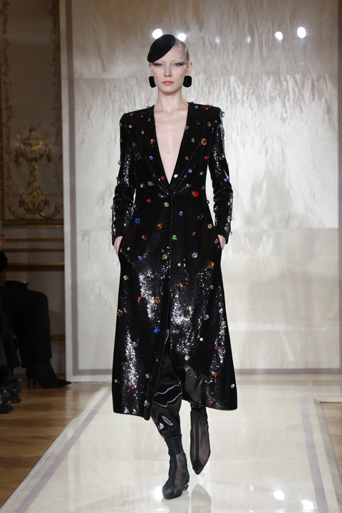
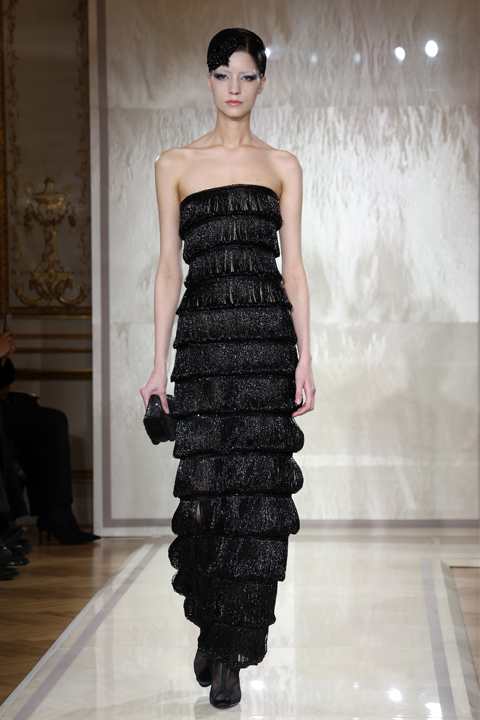
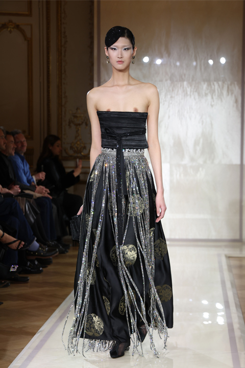
Haute Couture serisinin 20. Yıldönümünde İtalyan modacı hem görkemin ve zarafetin ustaca sergilendiği bir koleksiyonla karşımızdaydı. Metalik saten elbiseler, inciler ve incelikle işlenmiş kristallerle bezenmiş siluetler, rafine takımlar podyumda geçit töreni yaptı.
1
.circle {
position: relative;
width: 70px;
height: 70px;
cursor: pointer;
}
.circle svg {
fill: none;
stroke: #8a3ab9;
stroke-linecap: round;
stroke-width: 3;
stroke-dasharray: 1;
stroke-dashoffset: 0;
animation: stroke-draw 2s cubic-bezier(0.77, 0, 0.175, 1) infinite alternate;
display:block!important
}
.circle img {
position: absolute;
left: 50%;
top: 50%;
transform: translate(-50%, -50%);
border-radius: 50%;
}
@keyframes stroke-draw {
from {
stroke: #8a3ab9;
stroke-dasharray: 1;
}
to {
stroke: #cd486b;
transform: rotate(180deg);
stroke-dasharray: 8;
}
}
2
.circle {
position: relative;
width: 70px;
height: 70px;
cursor: pointer;
}
.circle svg {
fill: none;
stroke: #8a3ab9;
stroke-linecap: round;
stroke-width: 3;
stroke-dasharray: 1;
stroke-dashoffset: 0;
animation: stroke-draw 2s cubic-bezier(0.77, 0, 0.175, 1) infinite alternate;
display:block!important
}
.circle img {
position: absolute;
left: 50%;
top: 50%;
transform: translate(-50%, -50%);
border-radius: 50%;
}
@keyframes stroke-draw {
from {
stroke: #8a3ab9;
stroke-dasharray: 1;
}
to {
stroke: #cd486b;
transform: rotate(180deg);
stroke-dasharray: 8;
}
}
3
.circle {
position: relative;
width: 70px;
height: 70px;
cursor: pointer;
}
.circle svg {
fill: none;
stroke: #8a3ab9;
stroke-linecap: round;
stroke-width: 3;
stroke-dasharray: 1;
stroke-dashoffset: 0;
animation: stroke-draw 2s cubic-bezier(0.77, 0, 0.175, 1) infinite alternate;
display:block!important
}
.circle img {
position: absolute;
left: 50%;
top: 50%;
transform: translate(-50%, -50%);
border-radius: 50%;
}
@keyframes stroke-draw {
from {
stroke: #8a3ab9;
stroke-dasharray: 1;
}
to {
stroke: #cd486b;
transform: rotate(180deg);
stroke-dasharray: 8;
}
}
4
.circle {
position: relative;
width: 70px;
height: 70px;
cursor: pointer;
}
.circle svg {
fill: none;
stroke: #8a3ab9;
stroke-linecap: round;
stroke-width: 3;
stroke-dasharray: 1;
stroke-dashoffset: 0;
animation: stroke-draw 2s cubic-bezier(0.77, 0, 0.175, 1) infinite alternate;
display:block!important
}
.circle img {
position: absolute;
left: 50%;
top: 50%;
transform: translate(-50%, -50%);
border-radius: 50%;
}
@keyframes stroke-draw {
from {
stroke: #8a3ab9;
stroke-dasharray: 1;
}
to {
stroke: #cd486b;
transform: rotate(180deg);
stroke-dasharray: 8;
}
}
5
.circle {
position: relative;
width: 70px;
height: 70px;
cursor: pointer;
}
.circle svg {
fill: none;
stroke: #8a3ab9;
stroke-linecap: round;
stroke-width: 3;
stroke-dasharray: 1;
stroke-dashoffset: 0;
animation: stroke-draw 2s cubic-bezier(0.77, 0, 0.175, 1) infinite alternate;
display:block!important
}
.circle img {
position: absolute;
left: 50%;
top: 50%;
transform: translate(-50%, -50%);
border-radius: 50%;
}
@keyframes stroke-draw {
from {
stroke: #8a3ab9;
stroke-dasharray: 1;
}
to {
stroke: #cd486b;
transform: rotate(180deg);
stroke-dasharray: 8;
}
}
6
.circle {
position: relative;
width: 70px;
height: 70px;
cursor: pointer;
}
.circle svg {
fill: none;
stroke: #8a3ab9;
stroke-linecap: round;
stroke-width: 3;
stroke-dasharray: 1;
stroke-dashoffset: 0;
animation: stroke-draw 2s cubic-bezier(0.77, 0, 0.175, 1) infinite alternate;
display:block!important
}
.circle img {
position: absolute;
left: 50%;
top: 50%;
transform: translate(-50%, -50%);
border-radius: 50%;
}
@keyframes stroke-draw {
from {
stroke: #8a3ab9;
stroke-dasharray: 1;
}
to {
stroke: #cd486b;
transform: rotate(180deg);
stroke-dasharray: 8;
}
}
7
.circle {
position: relative;
width: 70px;
height: 70px;
cursor: pointer;
}
.circle svg {
fill: none;
stroke: #8a3ab9;
stroke-linecap: round;
stroke-width: 3;
stroke-dasharray: 1;
stroke-dashoffset: 0;
animation: stroke-draw 2s cubic-bezier(0.77, 0, 0.175, 1) infinite alternate;
display:block!important
}
.circle img {
position: absolute;
left: 50%;
top: 50%;
transform: translate(-50%, -50%);
border-radius: 50%;
}
@keyframes stroke-draw {
from {
stroke: #8a3ab9;
stroke-dasharray: 1;
}
to {
stroke: #cd486b;
transform: rotate(180deg);
stroke-dasharray: 8;
}
}
8
.circle {
position: relative;
width: 70px;
height: 70px;
cursor: pointer;
}
.circle svg {
fill: none;
stroke: #8a3ab9;
stroke-linecap: round;
stroke-width: 3;
stroke-dasharray: 1;
stroke-dashoffset: 0;
animation: stroke-draw 2s cubic-bezier(0.77, 0, 0.175, 1) infinite alternate;
display:block!important
}
.circle img {
position: absolute;
left: 50%;
top: 50%;
transform: translate(-50%, -50%);
border-radius: 50%;
}
@keyframes stroke-draw {
from {
stroke: #8a3ab9;
stroke-dasharray: 1;
}
to {
stroke: #cd486b;
transform: rotate(180deg);
stroke-dasharray: 8;
}
}
9
.circle {
position: relative;
width: 70px;
height: 70px;
cursor: pointer;
}
.circle svg {
fill: none;
stroke: #8a3ab9;
stroke-linecap: round;
stroke-width: 3;
stroke-dasharray: 1;
stroke-dashoffset: 0;
animation: stroke-draw 2s cubic-bezier(0.77, 0, 0.175, 1) infinite alternate;
display:block!important
}
.circle img {
position: absolute;
left: 50%;
top: 50%;
transform: translate(-50%, -50%);
border-radius: 50%;
}
@keyframes stroke-draw {
from {
stroke: #8a3ab9;
stroke-dasharray: 1;
}
to {
stroke: #cd486b;
transform: rotate(180deg);
stroke-dasharray: 8;
}
}
10
.circle {
position: relative;
width: 70px;
height: 70px;
cursor: pointer;
}
.circle svg {
fill: none;
stroke: #8a3ab9;
stroke-linecap: round;
stroke-width: 3;
stroke-dasharray: 1;
stroke-dashoffset: 0;
animation: stroke-draw 2s cubic-bezier(0.77, 0, 0.175, 1) infinite alternate;
display:block!important
}
.circle img {
position: absolute;
left: 50%;
top: 50%;
transform: translate(-50%, -50%);
border-radius: 50%;
}
@keyframes stroke-draw {
from {
stroke: #8a3ab9;
stroke-dasharray: 1;
}
to {
stroke: #cd486b;
transform: rotate(180deg);
stroke-dasharray: 8;
}
}
11
.circle {
position: relative;
width: 70px;
height: 70px;
cursor: pointer;
}
.circle svg {
fill: none;
stroke: #8a3ab9;
stroke-linecap: round;
stroke-width: 3;
stroke-dasharray: 1;
stroke-dashoffset: 0;
animation: stroke-draw 2s cubic-bezier(0.77, 0, 0.175, 1) infinite alternate;
display:block!important
}
.circle img {
position: absolute;
left: 50%;
top: 50%;
transform: translate(-50%, -50%);
border-radius: 50%;
}
@keyframes stroke-draw {
from {
stroke: #8a3ab9;
stroke-dasharray: 1;
}
to {
stroke: #cd486b;
transform: rotate(180deg);
stroke-dasharray: 8;
}
}
12
.circle {
position: relative;
width: 70px;
height: 70px;
cursor: pointer;
}
.circle svg {
fill: none;
stroke: #8a3ab9;
stroke-linecap: round;
stroke-width: 3;
stroke-dasharray: 1;
stroke-dashoffset: 0;
animation: stroke-draw 2s cubic-bezier(0.77, 0, 0.175, 1) infinite alternate;
display:block!important
}
.circle img {
position: absolute;
left: 50%;
top: 50%;
transform: translate(-50%, -50%);
border-radius: 50%;
}
@keyframes stroke-draw {
from {
stroke: #8a3ab9;
stroke-dasharray: 1;
}
to {
stroke: #cd486b;
transform: rotate(180deg);
stroke-dasharray: 8;
}
}
13
.circle {
position: relative;
width: 70px;
height: 70px;
cursor: pointer;
}
.circle svg {
fill: none;
stroke: #8a3ab9;
stroke-linecap: round;
stroke-width: 3;
stroke-dasharray: 1;
stroke-dashoffset: 0;
animation: stroke-draw 2s cubic-bezier(0.77, 0, 0.175, 1) infinite alternate;
display:block!important
}
.circle img {
position: absolute;
left: 50%;
top: 50%;
transform: translate(-50%, -50%);
border-radius: 50%;
}
@keyframes stroke-draw {
from {
stroke: #8a3ab9;
stroke-dasharray: 1;
}
to {
stroke: #cd486b;
transform: rotate(180deg);
stroke-dasharray: 8;
}
}
14
.circle {
position: relative;
width: 70px;
height: 70px;
cursor: pointer;
}
.circle svg {
fill: none;
stroke: #8a3ab9;
stroke-linecap: round;
stroke-width: 3;
stroke-dasharray: 1;
stroke-dashoffset: 0;
animation: stroke-draw 2s cubic-bezier(0.77, 0, 0.175, 1) infinite alternate;
display:block!important
}
.circle img {
position: absolute;
left: 50%;
top: 50%;
transform: translate(-50%, -50%);
border-radius: 50%;
}
@keyframes stroke-draw {
from {
stroke: #8a3ab9;
stroke-dasharray: 1;
}
to {
stroke: #cd486b;
transform: rotate(180deg);
stroke-dasharray: 8;
}
}
15
.circle {
position: relative;
width: 70px;
height: 70px;
cursor: pointer;
}
.circle svg {
fill: none;
stroke: #8a3ab9;
stroke-linecap: round;
stroke-width: 3;
stroke-dasharray: 1;
stroke-dashoffset: 0;
animation: stroke-draw 2s cubic-bezier(0.77, 0, 0.175, 1) infinite alternate;
display:block!important
}
.circle img {
position: absolute;
left: 50%;
top: 50%;
transform: translate(-50%, -50%);
border-radius: 50%;
}
@keyframes stroke-draw {
from {
stroke: #8a3ab9;
stroke-dasharray: 1;
}
to {
stroke: #cd486b;
transform: rotate(180deg);
stroke-dasharray: 8;
}
}
16
.circle {
position: relative;
width: 70px;
height: 70px;
cursor: pointer;
}
.circle svg {
fill: none;
stroke: #8a3ab9;
stroke-linecap: round;
stroke-width: 3;
stroke-dasharray: 1;
stroke-dashoffset: 0;
animation: stroke-draw 2s cubic-bezier(0.77, 0, 0.175, 1) infinite alternate;
display:block!important
}
.circle img {
position: absolute;
left: 50%;
top: 50%;
transform: translate(-50%, -50%);
border-radius: 50%;
}
@keyframes stroke-draw {
from {
stroke: #8a3ab9;
stroke-dasharray: 1;
}
to {
stroke: #cd486b;
transform: rotate(180deg);
stroke-dasharray: 8;
}
}
17
.circle {
position: relative;
width: 70px;
height: 70px;
cursor: pointer;
}
.circle svg {
fill: none;
stroke: #8a3ab9;
stroke-linecap: round;
stroke-width: 3;
stroke-dasharray: 1;
stroke-dashoffset: 0;
animation: stroke-draw 2s cubic-bezier(0.77, 0, 0.175, 1) infinite alternate;
display:block!important
}
.circle img {
position: absolute;
left: 50%;
top: 50%;
transform: translate(-50%, -50%);
border-radius: 50%;
}
@keyframes stroke-draw {
from {
stroke: #8a3ab9;
stroke-dasharray: 1;
}
to {
stroke: #cd486b;
transform: rotate(180deg);
stroke-dasharray: 8;
}
}
18
.circle {
position: relative;
width: 70px;
height: 70px;
cursor: pointer;
}
.circle svg {
fill: none;
stroke: #8a3ab9;
stroke-linecap: round;
stroke-width: 3;
stroke-dasharray: 1;
stroke-dashoffset: 0;
animation: stroke-draw 2s cubic-bezier(0.77, 0, 0.175, 1) infinite alternate;
display:block!important
}
.circle img {
position: absolute;
left: 50%;
top: 50%;
transform: translate(-50%, -50%);
border-radius: 50%;
}
@keyframes stroke-draw {
from {
stroke: #8a3ab9;
stroke-dasharray: 1;
}
to {
stroke: #cd486b;
transform: rotate(180deg);
stroke-dasharray: 8;
}
}
19
Getty Images
.circle {
position: relative;
width: 70px;
height: 70px;
cursor: pointer;
}
.circle svg {
fill: none;
stroke: #8a3ab9;
stroke-linecap: round;
stroke-width: 3;
stroke-dasharray: 1;
stroke-dashoffset: 0;
animation: stroke-draw 2s cubic-bezier(0.77, 0, 0.175, 1) infinite alternate;
display:block!important
}
.circle img {
position: absolute;
left: 50%;
top: 50%;
transform: translate(-50%, -50%);
border-radius: 50%;
}
@keyframes stroke-draw {
from {
stroke: #8a3ab9;
stroke-dasharray: 1;
}
to {
stroke: #cd486b;
transform: rotate(180deg);
stroke-dasharray: 8;
}
}
20
.circle {
position: relative;
width: 70px;
height: 70px;
cursor: pointer;
}
.circle svg {
fill: none;
stroke: #8a3ab9;
stroke-linecap: round;
stroke-width: 3;
stroke-dasharray: 1;
stroke-dashoffset: 0;
animation: stroke-draw 2s cubic-bezier(0.77, 0, 0.175, 1) infinite alternate;
display:block!important
}
.circle img {
position: absolute;
left: 50%;
top: 50%;
transform: translate(-50%, -50%);
border-radius: 50%;
}
@keyframes stroke-draw {
from {
stroke: #8a3ab9;
stroke-dasharray: 1;
}
to {
stroke: #cd486b;
transform: rotate(180deg);
stroke-dasharray: 8;
}
}
21
.circle {
position: relative;
width: 70px;
height: 70px;
cursor: pointer;
}
.circle svg {
fill: none;
stroke: #8a3ab9;
stroke-linecap: round;
stroke-width: 3;
stroke-dasharray: 1;
stroke-dashoffset: 0;
animation: stroke-draw 2s cubic-bezier(0.77, 0, 0.175, 1) infinite alternate;
display:block!important
}
.circle img {
position: absolute;
left: 50%;
top: 50%;
transform: translate(-50%, -50%);
border-radius: 50%;
}
@keyframes stroke-draw {
from {
stroke: #8a3ab9;
stroke-dasharray: 1;
}
to {
stroke: #cd486b;
transform: rotate(180deg);
stroke-dasharray: 8;
}
}
22
.circle {
position: relative;
width: 70px;
height: 70px;
cursor: pointer;
}
.circle svg {
fill: none;
stroke: #8a3ab9;
stroke-linecap: round;
stroke-width: 3;
stroke-dasharray: 1;
stroke-dashoffset: 0;
animation: stroke-draw 2s cubic-bezier(0.77, 0, 0.175, 1) infinite alternate;
display:block!important
}
.circle img {
position: absolute;
left: 50%;
top: 50%;
transform: translate(-50%, -50%);
border-radius: 50%;
}
@keyframes stroke-draw {
from {
stroke: #8a3ab9;
stroke-dasharray: 1;
}
to {
stroke: #cd486b;
transform: rotate(180deg);
stroke-dasharray: 8;
}
}
23
.circle {
position: relative;
width: 70px;
height: 70px;
cursor: pointer;
}
.circle svg {
fill: none;
stroke: #8a3ab9;
stroke-linecap: round;
stroke-width: 3;
stroke-dasharray: 1;
stroke-dashoffset: 0;
animation: stroke-draw 2s cubic-bezier(0.77, 0, 0.175, 1) infinite alternate;
display:block!important
}
.circle img {
position: absolute;
left: 50%;
top: 50%;
transform: translate(-50%, -50%);
border-radius: 50%;
}
@keyframes stroke-draw {
from {
stroke: #8a3ab9;
stroke-dasharray: 1;
}
to {
stroke: #cd486b;
transform: rotate(180deg);
stroke-dasharray: 8;
}
}
24
.circle {
position: relative;
width: 70px;
height: 70px;
cursor: pointer;
}
.circle svg {
fill: none;
stroke: #8a3ab9;
stroke-linecap: round;
stroke-width: 3;
stroke-dasharray: 1;
stroke-dashoffset: 0;
animation: stroke-draw 2s cubic-bezier(0.77, 0, 0.175, 1) infinite alternate;
display:block!important
}
.circle img {
position: absolute;
left: 50%;
top: 50%;
transform: translate(-50%, -50%);
border-radius: 50%;
}
@keyframes stroke-draw {
from {
stroke: #8a3ab9;
stroke-dasharray: 1;
}
to {
stroke: #cd486b;
transform: rotate(180deg);
stroke-dasharray: 8;
}
}
25
.circle {
position: relative;
width: 70px;
height: 70px;
cursor: pointer;
}
.circle svg {
fill: none;
stroke: #8a3ab9;
stroke-linecap: round;
stroke-width: 3;
stroke-dasharray: 1;
stroke-dashoffset: 0;
animation: stroke-draw 2s cubic-bezier(0.77, 0, 0.175, 1) infinite alternate;
display:block!important
}
.circle img {
position: absolute;
left: 50%;
top: 50%;
transform: translate(-50%, -50%);
border-radius: 50%;
}
@keyframes stroke-draw {
from {
stroke: #8a3ab9;
stroke-dasharray: 1;
}
to {
stroke: #cd486b;
transform: rotate(180deg);
stroke-dasharray: 8;
}
}
26
.circle {
position: relative;
width: 70px;
height: 70px;
cursor: pointer;
}
.circle svg {
fill: none;
stroke: #8a3ab9;
stroke-linecap: round;
stroke-width: 3;
stroke-dasharray: 1;
stroke-dashoffset: 0;
animation: stroke-draw 2s cubic-bezier(0.77, 0, 0.175, 1) infinite alternate;
display:block!important
}
.circle img {
position: absolute;
left: 50%;
top: 50%;
transform: translate(-50%, -50%);
border-radius: 50%;
}
@keyframes stroke-draw {
from {
stroke: #8a3ab9;
stroke-dasharray: 1;
}
to {
stroke: #cd486b;
transform: rotate(180deg);
stroke-dasharray: 8;
}
}
27
.circle {
position: relative;
width: 70px;
height: 70px;
cursor: pointer;
}
.circle svg {
fill: none;
stroke: #8a3ab9;
stroke-linecap: round;
stroke-width: 3;
stroke-dasharray: 1;
stroke-dashoffset: 0;
animation: stroke-draw 2s cubic-bezier(0.77, 0, 0.175, 1) infinite alternate;
display:block!important
}
.circle img {
position: absolute;
left: 50%;
top: 50%;
transform: translate(-50%, -50%);
border-radius: 50%;
}
@keyframes stroke-draw {
from {
stroke: #8a3ab9;
stroke-dasharray: 1;
}
to {
stroke: #cd486b;
transform: rotate(180deg);
stroke-dasharray: 8;
}
}
28
.circle {
position: relative;
width: 70px;
height: 70px;
cursor: pointer;
}
.circle svg {
fill: none;
stroke: #8a3ab9;
stroke-linecap: round;
stroke-width: 3;
stroke-dasharray: 1;
stroke-dashoffset: 0;
animation: stroke-draw 2s cubic-bezier(0.77, 0, 0.175, 1) infinite alternate;
display:block!important
}
.circle img {
position: absolute;
left: 50%;
top: 50%;
transform: translate(-50%, -50%);
border-radius: 50%;
}
@keyframes stroke-draw {
from {
stroke: #8a3ab9;
stroke-dasharray: 1;
}
to {
stroke: #cd486b;
transform: rotate(180deg);
stroke-dasharray: 8;
}
}
29
.circle {
position: relative;
width: 70px;
height: 70px;
cursor: pointer;
}
.circle svg {
fill: none;
stroke: #8a3ab9;
stroke-linecap: round;
stroke-width: 3;
stroke-dasharray: 1;
stroke-dashoffset: 0;
animation: stroke-draw 2s cubic-bezier(0.77, 0, 0.175, 1) infinite alternate;
display:block!important
}
.circle img {
position: absolute;
left: 50%;
top: 50%;
transform: translate(-50%, -50%);
border-radius: 50%;
}
@keyframes stroke-draw {
from {
stroke: #8a3ab9;
stroke-dasharray: 1;
}
to {
stroke: #cd486b;
transform: rotate(180deg);
stroke-dasharray: 8;
}
}
30
.circle {
position: relative;
width: 70px;
height: 70px;
cursor: pointer;
}
.circle svg {
fill: none;
stroke: #8a3ab9;
stroke-linecap: round;
stroke-width: 3;
stroke-dasharray: 1;
stroke-dashoffset: 0;
animation: stroke-draw 2s cubic-bezier(0.77, 0, 0.175, 1) infinite alternate;
display:block!important
}
.circle img {
position: absolute;
left: 50%;
top: 50%;
transform: translate(-50%, -50%);
border-radius: 50%;
}
@keyframes stroke-draw {
from {
stroke: #8a3ab9;
stroke-dasharray: 1;
}
to {
stroke: #cd486b;
transform: rotate(180deg);
stroke-dasharray: 8;
}
}
31
.circle {
position: relative;
width: 70px;
height: 70px;
cursor: pointer;
}
.circle svg {
fill: none;
stroke: #8a3ab9;
stroke-linecap: round;
stroke-width: 3;
stroke-dasharray: 1;
stroke-dashoffset: 0;
animation: stroke-draw 2s cubic-bezier(0.77, 0, 0.175, 1) infinite alternate;
display:block!important
}
.circle img {
position: absolute;
left: 50%;
top: 50%;
transform: translate(-50%, -50%);
border-radius: 50%;
}
@keyframes stroke-draw {
from {
stroke: #8a3ab9;
stroke-dasharray: 1;
}
to {
stroke: #cd486b;
transform: rotate(180deg);
stroke-dasharray: 8;
}
}
32
.circle {
position: relative;
width: 70px;
height: 70px;
cursor: pointer;
}
.circle svg {
fill: none;
stroke: #8a3ab9;
stroke-linecap: round;
stroke-width: 3;
stroke-dasharray: 1;
stroke-dashoffset: 0;
animation: stroke-draw 2s cubic-bezier(0.77, 0, 0.175, 1) infinite alternate;
display:block!important
}
.circle img {
position: absolute;
left: 50%;
top: 50%;
transform: translate(-50%, -50%);
border-radius: 50%;
}
@keyframes stroke-draw {
from {
stroke: #8a3ab9;
stroke-dasharray: 1;
}
to {
stroke: #cd486b;
transform: rotate(180deg);
stroke-dasharray: 8;
}
}
33
.circle {
position: relative;
width: 70px;
height: 70px;
cursor: pointer;
}
.circle svg {
fill: none;
stroke: #8a3ab9;
stroke-linecap: round;
stroke-width: 3;
stroke-dasharray: 1;
stroke-dashoffset: 0;
animation: stroke-draw 2s cubic-bezier(0.77, 0, 0.175, 1) infinite alternate;
display:block!important
}
.circle img {
position: absolute;
left: 50%;
top: 50%;
transform: translate(-50%, -50%);
border-radius: 50%;
}
@keyframes stroke-draw {
from {
stroke: #8a3ab9;
stroke-dasharray: 1;
}
to {
stroke: #cd486b;
transform: rotate(180deg);
stroke-dasharray: 8;
}
}
34
.circle {
position: relative;
width: 70px;
height: 70px;
cursor: pointer;
}
.circle svg {
fill: none;
stroke: #8a3ab9;
stroke-linecap: round;
stroke-width: 3;
stroke-dasharray: 1;
stroke-dashoffset: 0;
animation: stroke-draw 2s cubic-bezier(0.77, 0, 0.175, 1) infinite alternate;
display:block!important
}
.circle img {
position: absolute;
left: 50%;
top: 50%;
transform: translate(-50%, -50%);
border-radius: 50%;
}
@keyframes stroke-draw {
from {
stroke: #8a3ab9;
stroke-dasharray: 1;
}
to {
stroke: #cd486b;
transform: rotate(180deg);
stroke-dasharray: 8;
}
}
35
.circle {
position: relative;
width: 70px;
height: 70px;
cursor: pointer;
}
.circle svg {
fill: none;
stroke: #8a3ab9;
stroke-linecap: round;
stroke-width: 3;
stroke-dasharray: 1;
stroke-dashoffset: 0;
animation: stroke-draw 2s cubic-bezier(0.77, 0, 0.175, 1) infinite alternate;
display:block!important
}
.circle img {
position: absolute;
left: 50%;
top: 50%;
transform: translate(-50%, -50%);
border-radius: 50%;
}
@keyframes stroke-draw {
from {
stroke: #8a3ab9;
stroke-dasharray: 1;
}
to {
stroke: #cd486b;
transform: rotate(180deg);
stroke-dasharray: 8;
}
}